Data Visualisation in R Using ggplot2
with tags ggplot2 r graphics -A major challenge in data analysis is to summarise and present data with informative graphs. The ggplot2 package was specifically designed to help with this task. Since it is a very powerful and well documented package1, this introduction will only focus on its basic syntax, so that the user gets a better understanding of how to read the supporting material on the internet.
ggplot graphs are built with some kind of blocks, which usually start with the function ggplot. Its first argument contains the data object and the second argument is a further function called aes.2 It controls, which columns of the data frame are used for the axes, colours, shapes of the data points and further features of the graph. The remaining blocks are separated by plus + signs and – if not specified otherwise – take the information from the first block and add a certain aspect to the graph, for example additional lines or data points. To understand what this all means, let us look at some basic examples.
library(ggplot2)
library(pwt9)
data <- pwt9.0
data_aut <- data[data$isocode == "AUT",]
Line plots
In order to plot the time series of the Austrian GDP per capita we use the following code:
data_aut <- cbind(data_aut, "GDP.pc" = data_aut$rgdpe / data_aut$pop)

ggplot(data_aut, aes(x = year, y = GDP.pc)) +
  geom_line()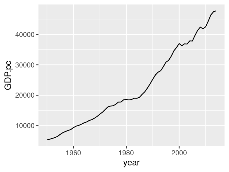
After the execution of the line the graph should appear in the lower right window of RStudio. If not, just click on the tab Plots in that window and you should see it.
The first block in the line you just executed – ggplot(data_aut, aes(x = year, y = GDP.pc)) – tells R that it should use the data frame data_aut as the main source of data for everything that follows. And the aes function tells R that the column year in data_aut should be used to map the data on the x axis and the corresponding values in column GDP.pc should be used to map the data on the y axis.
The second block – geom_line() – does not require any further specifications, because all the necessary information was specified in the first block. It just adds the line to the graph. To see that more clearly, you could just execute the first block and notice that only an empty graph with predefined x- and y-axes – that have the range of the actual data – is displayed. The only thing missing is the line of the time series. Therefore, it is necessary to add the second block.
Note that it was not necessary here to write data = data_aut to specify the data used for the graph and – unless the column names contain spaces – it is not necessary to write the variable names in quotations marks neither. However, if you want to add a title manually, quotation marks still will be required. But do not worry. If this requirement is not met, R will give an error message anyway.
Note that in a lot of examples on the internet the first block of a ggplot graph is saved as a separate object. This can be very convenient, if somebody wanted to try out different graph specifications with the same data. In our time series example this could look like this:
g <- ggplot(data_aut, aes(x = year, y = GDP.pc))

g + geom_line()
The layout of the current graph does not look very appealing. But this can be changed relatively quickly with some more blocks. In the following code the explanation of each line is given in the form of a comment.
# Specify the data and rescale the values of the y axis
ggplot(data_aut, aes(x = year, y = GDP.pc / 1000)) +
  geom_line() + # Add a line to the plot
  labs(title = "GDP per Capita (Austria)", # Add a title
       caption = "Source: Penn World Table 9.0.", # Add a caption at the bottom
       x = "Year", y = "Thousand Dollars") +  # Rename the title of the x-axis
  theme_classic() # Usa a predefined theme of the graph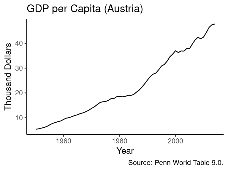
If you wanted to compare the evolution of GDP per capita across Austria, France, Germany and Switzerland as calculated in the last section, you could basically use the same code. The only thing we have to change would be that we use a different data source – data_multi – and to add colour = country as an additional argument to the aes function. This tells R that it has to separate the GDP per capita values per year according to the name in the column Country in the data_multi data frame.
data_multi <- data[data$country%in%c("Austria", "France", "Germany", "Switzerland"),]
data_multi <- cbind(data_multi, "GDP.pc" = data_multi$rgdpe/data_multi$pop)

# Specify the data and rescale the values of the y axis
ggplot(data_multi, aes(x = year, y = GDP.pc / 1000, colour = country)) +
  geom_line() + # Add a line to the plot
  # The function labs allows to add and change labels like a title
  labs(title = "GDP per Capita",
       subtitle = "In thousand Dollars", # Add a subtitle
       caption = "Source: Penn World Table 9.0.", # Add a caption
       x = "Year") +  # Rename the title of the x-axis
  theme_classic() + # Usa a predefined theme of the graph
  # theme() changes further features of a graph.
  theme(axis.title.y = element_blank()) # Here: delete the title of the y axis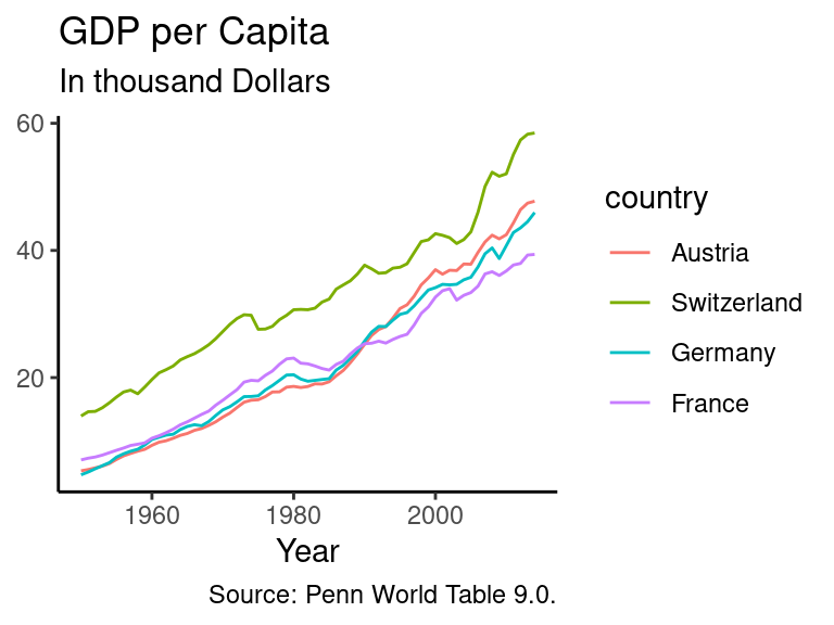
If you do not want to use colours, but instead prefer different line types to separate the countries’ values, this can be done by replacing the colour argument with linetype. Furthermore, you can rename the title of the legend with the scale_abc_xyz function by specifying the name argument, i.e. scale_linetype_discrete(name = "Country") in this example.
# Specify the data and rescale the values of the y axis
ggplot(data_multi, aes(x = year, y = GDP.pc / 1000, linetype = country)) +
  geom_line() + # Add a line to the plot
  labs(title = "GDP per Capita", # Add a title
       subtitle = "In thousand Dollars", # Add a subtitle
       caption = "Source: Penn World Table 9.0.", # Add a caption
       x = "Year") +  # Rename the title of the x-axis
  scale_linetype_discrete(name = "Country") + # Change title of the legend
  theme_classic() + # Usa a predefined theme of the graph
  theme(axis.title.y = element_blank()) # Delete the title of the y axis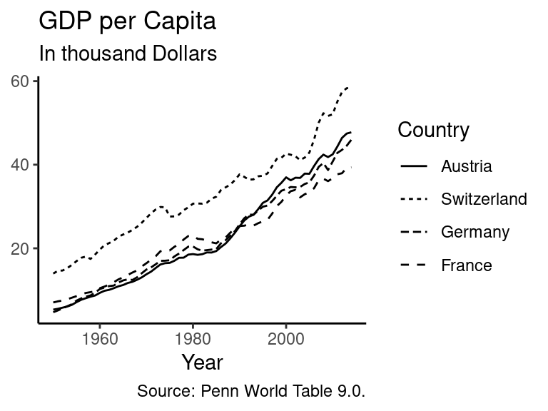
Bar charts
Another popular type of graphs are bar charts, which can be useful when the share of single components in an aggregate are of interest. In the following example a new data frame is created, which contains real GDP values for Austria, France, Germany and Switzerland from the year 2000 until 2013. Afterwards the bar chart is created. Again, nearly the same code as in the previous sub-section is used.
library(dplyr)

# Extract data
data_gdp <- data %>%
  filter(country %in% c("Austria", "France", "Germany", "Switzerland"),
         year >= 2000, year <= 2013) %>%
  select(year, country, rgdpe) %>% # Select the relevant columns
  rename(Year = year, Country = country, GDP = rgdpe) # Rename columns

# Create graph
# Specify the data and rescale the values of the y axis
ggplot(data_gdp, aes(x = Year, y = GDP / 1000, fill = Country)) +
  geom_bar(stat = "identity") + # Add bars to the plot
  labs(title = "GDP", # Add a title
       subtitle = "In billion Dollars", # Add a subtitle
       caption = "Source: Penn World Table 9.0.", # Add a caption
       x = "Year") +  # Rename the title of the x-axis
  # Change the standard set of colours used to fill the bars
  scale_fill_brewer(palette = "Set1") +
  theme_classic() + # Usa a predefined theme of the graph
  theme(axis.title.y = element_blank()) # Delete the title of the y axis)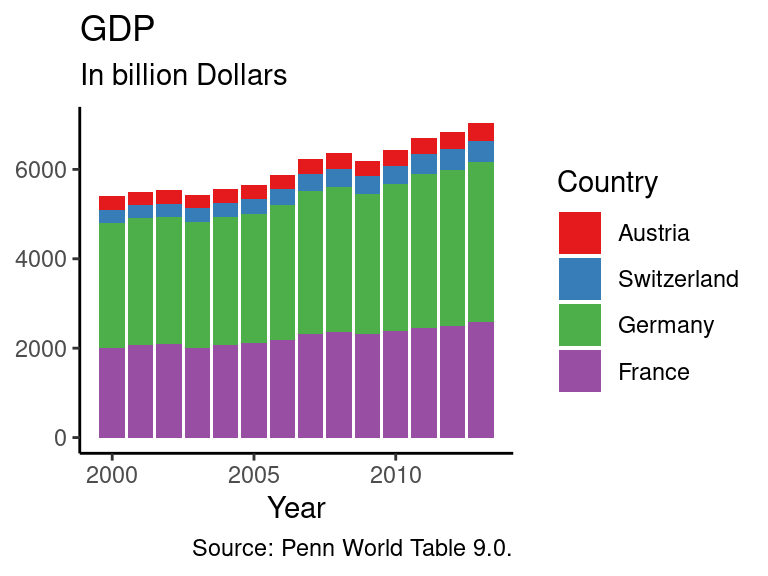
The only differences are:
- A new data source,
data_gdp, is used. - Instead of
geom_line()we usegeom_bar()to indicate that the output should be a bar chart. Note that in this case the argumentstat = "identity"must be used. Otherwise this will result in an error message. Furthermore, if you were exclusively interested in the distribution of the countries’ shares in aggregate GDP and not in the overall size of GDP, you could add the argumentposition = "fill"to thegeom_barfunction and see what happens. - The colour argument from above was replaced by
fill = Countryin theaesfunction. If this had not been done, the resulting graph would consist of grey bars with coloured frames. - Instead of filling the bars with standard colours we use a different palette by adding the block
scale_fill_brewer(palette = "Set1"). Note that this is also possible with line plots, but if the argumentcolour = Countryis used in theaesfunction, we will have to usescale_colour_brewer(palette = "Set1")instead.
Note that if we had not specified the fill argument in the aes function, ggplot would just have summed up the values over all countries per year.
Scatterplots
Scatterplots can be useful to illustrate the correlation between two variables of a sample. For example, the PWT contains information on human capital, GDP and the number of persons who are engaged. Therefore, it could be interesting to check, whether there is a relationship between human capital and output per worker across countries. In order to do this, we filter the observations for the last available year, i.e. 2014, calculate the ratio of GDP per worker, select the relevant columns and rename their titles.
Looking at the resulting data frame with data_hc we notice that there are some cells which contain the value NA. This means that these values are not available. When plotting the data, ggplot will notice these data points, omit them from the sample and give a warning that they were removed. In order to avoid this warning, the missing values can be manually dropped with the function na.omit.
# Prepare data
# Use the pwt data frame and extract observations from 2014
data_hc <- data %>% filter(year == 2014) %>%
  # Calculate GDP per worker and add it to the existing data frame
  mutate(GDP.worker = rgdpe / emp) %>%
  select(country, GDP.worker, hc) %>% # Select the relevant columns
  rename(Country = country, Human.Capital = hc) # Rename columns

data_hc <- na.omit(data_hc) # Omit NA values
The scatterplot is created in a similar manner as the graphs created above. The first function contains the data frame data_hc with the data and the function aes specifies that the columns Human.Capital and GDP.worker contain data on the position of the points on the x- and y-axis, respectively. The second function, geom_point(), introduces the points of the scatterplot. The argument title contains the character \n, which indicates, that at this point a new line should be started. This results in a plot title that has two lines and the break occurs at the position of the \n sign.
# Specify the data and rescale the values of the y axis
ggplot(data_hc, aes(x = Human.Capital, y = GDP.worker)) +
  geom_point() + # Add points of the scatterplot
  labs(title = "Relationship between human capital\nand output per worker", # Add title
       caption = "Source: Penn World Table 9.0.", # Add a caption
       x = "Human capital", y = "Output per worker") +  # Rename axes titles
  theme_classic() # Usa a predefined theme of the graph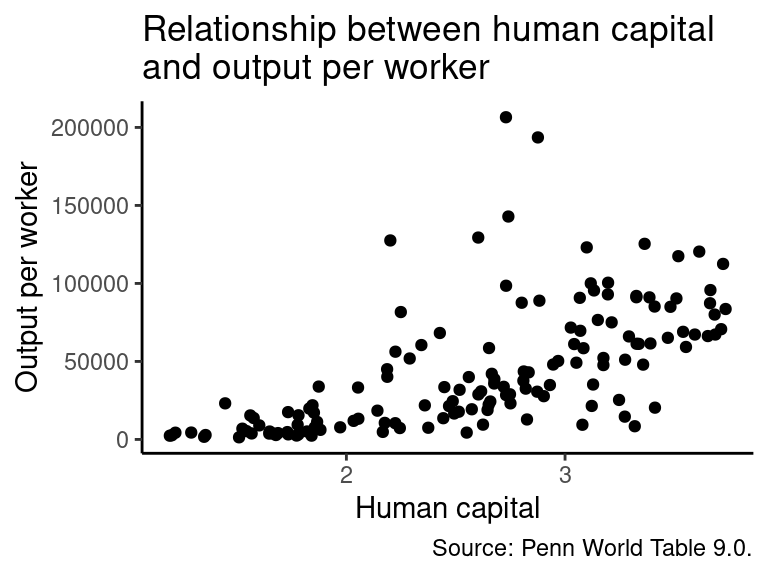
The plot implies that there is a positive correlation between human capital and output per worker, but output per worker seems to become more dispersed as the value of human capital increases. One solution to this issue might be to take the (natural) logarithm of output per worker and plot the graph again. The functions, which are required for this step, are already familiar. But instead of plotting the graph immediately, it is saved as an object named g, which is plotted afterwards by executing g.
# Adjust data
data_hc_log <- data_hc %>% # Use the data_hc data frame
  mutate(GDP.worker = log(GDP.worker)) # Replace GDP per worker with its natural logarithm

# Create graph and save it as object g without plotting
g <- ggplot(data_hc_log, aes(x = Human.Capital, y = GDP.worker)) +
  geom_point() + # Add points of the scatterplot
  labs(title = "Relationship between human capital\nand output per worker", # Add title
       caption = "Source: Penn World Table 9.0.", # Add a caption
       x = "Human capital", y = "Log of output per worker") +  # Rename axes titles
  theme_classic() # Usa a predefined theme of the graph

g # Plot graph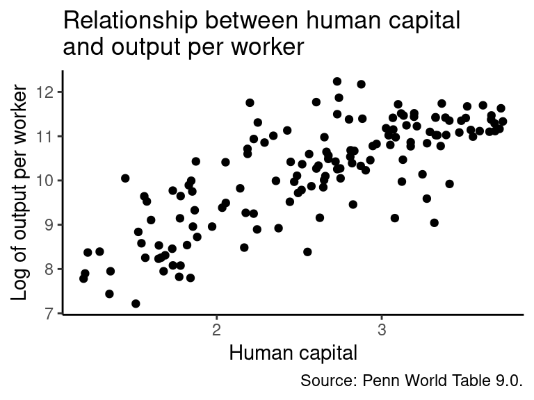
The positive relationship in the graph appears more clearly now, although the effect seems to weaken as the value of human capital increases, which might indicate decreasing marginal returns of human capital in terms of GDP per worker. But that is not important here.
Beside the help function in R the website of the
ggplot2package contains very good documentation and examples of the package’s functions. There is also a cheatsheet on the website of RStudio.↩︎This is short for “aesthetic mappings”.↩︎