Is Services Inflation a Catch-Up Story Everywhere in the Euro Area?
with tags r bvartools vecm error-correction inflation relative-prices hicp euro-areaHochmuth and Petz (2026) explain why services inflation in the euro area has come down so slowly: before the pandemic, services became steadily more expensive relative to goods, the surge of goods prices in 2021 and 2022 pushed this relative price far below its trend, and part of today’s services inflation is services prices catching up. In the reproduction of the paper the euro area results hold up, but in Austria the story does not fit: the relative price of services is already above its trend. This post estimates the model for all 21 countries of the euro area to find out where the explanation holds and where it does not. The short answer: the mechanism is there almost everywhere, but it explains little of why services inflation has differed so much between countries since 2023.
The model
Let \(s_t\) and \(n_t\) be 100 times the log price indices of services and non-energy industrial goods (NEIG) of a country. The relative price of services is assumed to follow a linear trend, from which it deviates only temporarily:
\[s_t - n_t = \mu + \delta t + z_t.\]
The deviation \(z_t\) is the relative-price gap. It is estimated as the residual of an OLS regression on a trend, and enters a Bayesian VECM as error correction term:
\[\Delta y_t = \kappa + \alpha \hat{z}_{t-1} + \Gamma \Delta y_{t-1} + \varepsilon_t, \quad \Delta y_t = (\Delta s_t, \Delta n_t)'.\]
A negative loading \(\alpha_s\) means that services inflation picks up when services are cheap relative to their trend, a positive \(\alpha_n\) that NEIG inflation slows. Both close the gap. The priors are those of the paper: standard normal on \(\kappa\), \(\alpha\) and \(\Gamma\), and \(\Sigma \sim IW(4, 0.01 I)\). The reproduction explains the model and its estimation with bvartools in more detail.
Data
The data are the monthly HICP indices of services and NEIG from Eurostat data set prc_hicp_minr for the euro area and its 21 members in 2026, including Croatia, which adopted the euro in 2023, and Bulgaria, which followed in 2026. In the current ECOICOP version 2 vintage, the two series start at different dates, the last ones in December 2000, so the sample runs from January 2001 to June 2026 for all countries. That is five years shorter than the paper’s, which starts in 1996. The download also includes the weights of gastronomy and accommodation in services, which come up further below:
library("bvartools")
library("dplyr")
library("ggplot2")
library("ggrepel")
library("knitr")
library("magrittr")
library("seasonal")
library("tibble")
library("tidyr")
# The euro area and its 21 members in 2026
countries <- c("EA", "AT", "BE", "BG", "CY", "DE", "EE", "EL", "ES", "FI", "FR",
"HR", "IE", "IT", "LT", "LU", "LV", "MT", "NL", "PT", "SI", "SK")
# Eurostat, ECOICOP ver. 2: services and NEIG, 2025 = 100
index_filters <- list(geo = countries,
unit = "I25",
coicop18 = c("SERV", "IGD_NNRG"))
get_eurostat("prc_hicp_minr",
time_format = "raw",
cache = FALSE,
filters = index_filters) %>%
transmute(geo,
month = as.character(time),
series = coicop18,
index = values) %>%
filter(month >= "2001-01", month <= "2026-06") %>%
pivot_wider(names_from = series, values_from = index) %>%
select(geo, month, SERV, IGD_NNRG) %>%
arrange(geo, month) %>%
write.csv("_2026-10-12-services-inflation-across-the-euro-area-hicp.csv",
row.names = FALSE)
# Weights of services, gastronomy and accommodation in 2026, in per mille
weight_filters <- list(geo = countries,
coicop18 = c("SERV", "CP111", "CP112"))
get_eurostat("prc_hicp_iw",
time_format = "raw",
cache = FALSE,
filters = weight_filters) %>%
filter(time == "2026") %>%
transmute(geo,
series = coicop18,
weight = values) %>%
pivot_wider(names_from = series, values_from = weight) %>%
select(geo, SERV, CP111, CP112) %>%
arrange(geo) %>%
write.csv("_2026-10-12-services-inflation-across-the-euro-area-weights.csv",
row.names = FALSE)hicp <- read.csv("_2026-10-12-services-inflation-across-the-euro-area-hicp.csv")
weights <- read.csv(
"_2026-10-12-services-inflation-across-the-euro-area-weights.csv")
country_names <- c(EA = "Euro area", AT = "Austria", BE = "Belgium",
BG = "Bulgaria", CY = "Cyprus", DE = "Germany",
EE = "Estonia", EL = "Greece", ES = "Spain",
FI = "Finland", FR = "France", HR = "Croatia",
IE = "Ireland", IT = "Italy", LT = "Lithuania",
LU = "Luxembourg", LV = "Latvia", MT = "Malta",
NL = "Netherlands", PT = "Portugal", SI = "Slovenia",
SK = "Slovakia")As in the paper, each series is seasonally adjusted with X-13ARIMA-SEATS and averaged to quarters. The first stage, the regression of the relative price on a trend over the whole sample, is run country by country:
prices <- hicp %>%
  pivot_longer(c(SERV, IGD_NNRG), names_to = "series", values_to = "index") %>%
  arrange(geo, series, month) %>%

  # X-13ARIMA-SEATS with the defaults of seasonal, series by series
  group_by(geo, series) %>%
  mutate(index_sa = ts(index, start = c(2001, 1), frequency = 12) %>%
           seas() %>%
           final() %>%
           as.numeric()) %>%
  ungroup() %>%

  # Quarterly averages, dated by the start of the quarter: 2001.25 is 2001 Q2
  mutate(year = as.integer(substr(month, 1, 4)),
         quarter = year + (as.integer(substr(month, 6, 7)) - 1) %/% 3 / 4) %>%
  group_by(geo, series, quarter) %>%
  summarise(index_sa = mean(index_sa), .groups = "drop") %>%
  pivot_wider(names_from = series, values_from = index_sa) %>%
  transmute(geo,
            quarter,
            s = 100 * log(SERV),
            n = 100 * log(IGD_NNRG)) %>%

  # Stage 1: the relative-price gap is the residual of a linear trend
  group_by(geo) %>%
  mutate(trend = row_number(),
         gap = residuals(lm(s - n ~ trend))) %>%
  ungroup() %>%
  mutate(country = factor(country_names[geo], levels = country_names))
The gaps
ggplot(prices, aes(x = quarter, y = gap)) +
  geom_hline(yintercept = 0) +
  geom_line(colour = "#0F4C81", linewidth = 0.6) +
  facet_wrap(~ country, ncol = 4) +
  scale_x_continuous(breaks = c(2005, 2015, 2025)) +
  labs(x = NULL,
       y = "Relative-price gap in %",
       title = "Price of services relative to NEIG, deviation from trend") +
  theme_bw()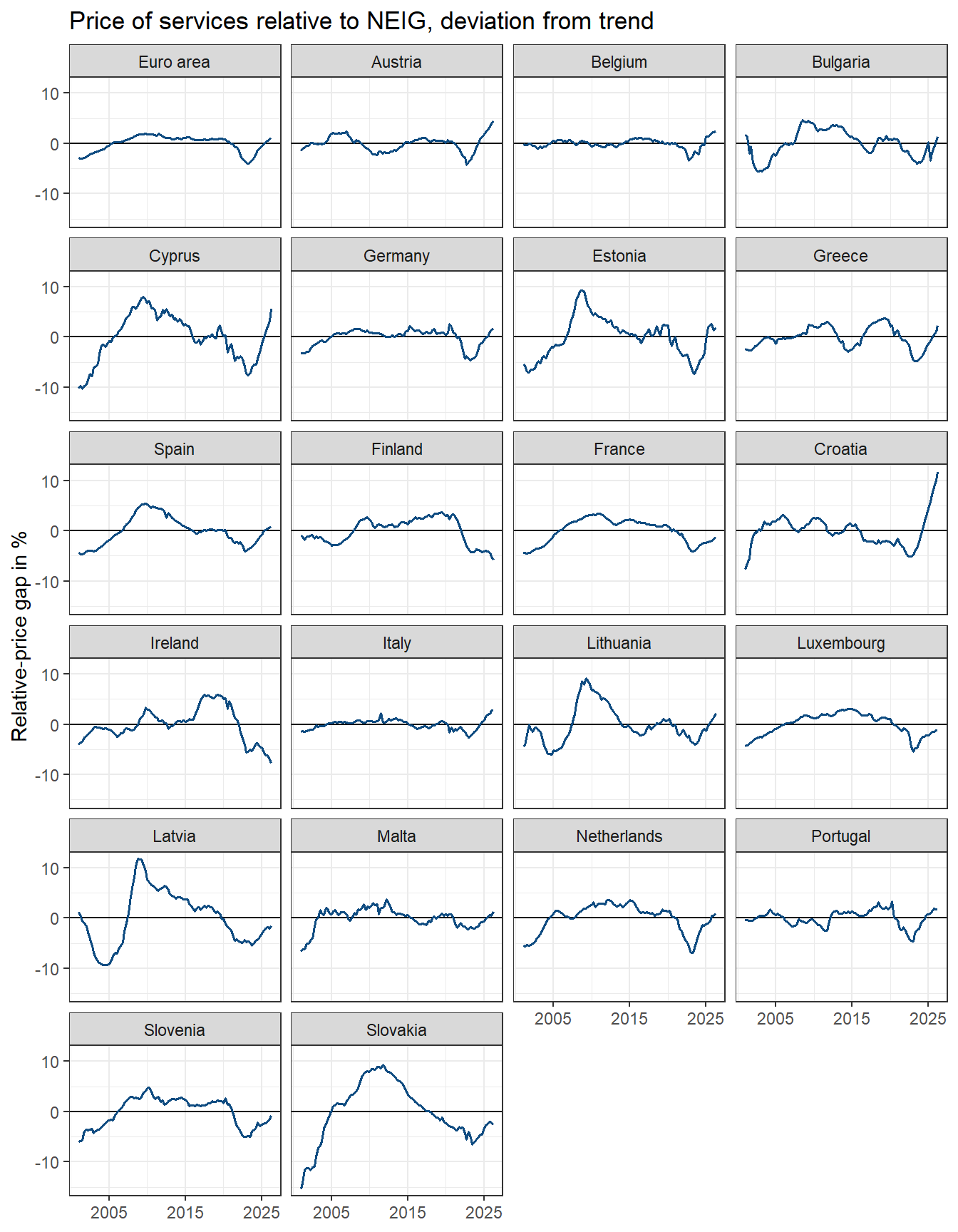
# The lowest gap during the shock of 2021 to 2023, and what happened after
shock <- function(quarter) {quarter >= 2021 & quarter < 2024}

gap_summary <- prices %>%
  group_by(geo, country) %>%
  summarise(trough = min(gap[shock(quarter)]),
            trough_quarter = quarter[shock(quarter)][which.min(gap[shock(quarter)])],
            latest = last(gap),
            elapsed = 4 * (last(quarter) - trough_quarter),

            # Annualised inflation since the trough and before 2020, in %
            services_since = 4 * (last(s) - s[quarter == trough_quarter]) /
              elapsed,
            services_before = 4 * mean(diff(s[quarter < 2020])),
            .groups = "drop") %>%
  mutate(closed = latest - trough,
         excess_services = services_since - services_before)
Up to 2021, the gaps of the euro area and of most of its western members stayed within a few percent of zero: services became more expensive relative to NEIG at a steady pace. The central and eastern European members and Cyprus saw larger swings in the 2000s, when their price levels were catching up with the rest of the EU. Then, in 2022 and 2023, every gap fell, in the euro area to -3.9%. What happened next differs a lot. In the second quarter of 2026, the gap is positive in 14 of the 21 countries, and most of all in Croatia (11.6%), Cyprus (5.5%) and Austria (4.6%). It is most negative in Ireland (-7.7%), Finland (-5.8%) and Slovakia (-2.6%), where services are still cheap relative to their trend, and in Ireland and Finland getting cheaper still.
Estimation
The second stage is estimated for each country exactly as in the reproduction. The sampler is run for 5,000 burn-in draws, after which 20,000 are kept:
estimate_gap_model <- function(data) {

  dy <- ts(diff(as.matrix(data[, c("s", "n")])),
           start = data[["quarter"]][2],
           frequency = 4)

  ect <- ts(matrix(head(data[["gap"]], -1), dimnames = list(NULL, "ect")),
            start = data[["quarter"]][2],
            frequency = 4)

  model <- create_bvarmodel(dy,
                            p = 1,
                            exogen = ect,
                            s = 0,
                            deterministic = "const",
                            iterations = 20000,
                            burnin = 5000)

  model <- add_priors(model,
                      coef = list(v_i = 1, v_i_det = 1),
                      sigma = list(df = 4, scale = 0.01))

  model <- add_initial_values(model, method = "ols")

  return(add_posterior_coefficients(model))
}

set.seed(20261012)

models <- prices %>%
  split(.[["geo"]]) %>%
  lapply(estimate_gap_model)
The draws of the coefficients are in posterior[["a"]][["coeffs"]], where the coefficient of equation \(i\) on regressor \(j\) is in column \((j - 1) k + i\). The regressors are the lags of \(s\) and \(n\), the error correction term and the constant:
draws <- lapply(models, function(model) {
  a <- as.matrix(model[["posterior"]][["a"]][["coeffs"]])
  k <- model[["model"]][["k"]]
  data.frame(gamma_ss = a[, 1],
             gamma_ns = a[, 2],
             gamma_sn = a[, k + 1],
             gamma_nn = a[, k + 2],
             alpha_s = a[, 2 * k + 1],
             alpha_n = a[, 2 * k + 2])
}) %>%
  bind_rows(.id = "geo")
loadings <- draws %>%
pivot_longer(c(alpha_s, alpha_n), names_to = "loading", values_to = "value") %>%
group_by(geo, loading) %>%
summarise(median = median(value),
lower = quantile(value, 0.025),
upper = quantile(value, 0.975),
.groups = "drop") %>%
mutate(country = country_names[geo])
# Countries ordered by the services loading
country_order <- loadings %>%
filter(loading == "alpha_s") %>%
arrange(desc(median)) %>%
pull(country)
loadings %>%
mutate(country = factor(country, levels = country_order),
loading = factor(loading,
levels = c("alpha_s", "alpha_n"),
labels = c("Services", "NEIG"))) %>%
ggplot(aes(x = median, y = country, colour = geo == "EA")) +
geom_vline(xintercept = 0) +
geom_pointrange(aes(xmin = lower, xmax = upper), size = 0.3) +
facet_wrap(~ loading) +
scale_colour_manual(values = c("#0F4C81", "#C10016"), guide = "none") +
labs(x = "Loading on the relative-price gap (median and 95% interval)",
y = NULL) +
theme_bw()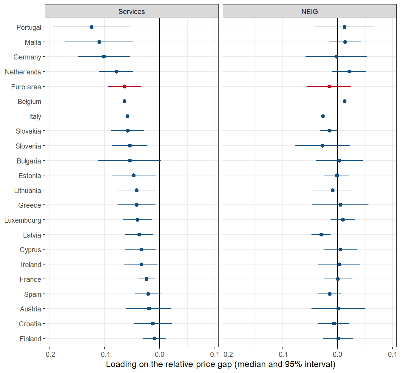
Services inflation responds to a gap everywhere in the expected direction: the median of \(\alpha_s\) is negative in all countries, and in 16 of 21 its 95% interval excludes zero. The response is strongest in Portugal, Malta and Germany, and it cannot be told apart from zero in Finland, Croatia, Austria, Spain and Bulgaria. NEIG inflation, on the other hand, hardly ever responds: its loading is clearly different from zero only in Latvia. Across the euro area, it is services prices that do the adjusting.
How fast do the gaps close?
To translate the loadings into a speed of adjustment, the model is simulated as in the paper, in deviations from a baseline without a gap: starting from \(z_0 = -1\) and \(\Delta y_0 = 0\),
\[\Delta y_h = \alpha z_{h-1} + \Gamma \Delta y_{h-1}, \quad z_h = z_{h-1} + \Delta s_h - \Delta n_h.\]
The function below runs this recursion for all draws of a country at once and returns the remaining gap, in percent of the initial one, for each draw and quarter:
remaining_gap <- function(d, horizon = 80) {
  z <- rep(-1, nrow(d))
  ds <- rep(0, nrow(d))
  dn <- rep(0, nrow(d))
  result <- matrix(NA, nrow(d), horizon)

  for (h in seq_len(horizon)) {
    ds_new <- d[["alpha_s"]] * z + d[["gamma_ss"]] * ds + d[["gamma_sn"]] * dn
    dn_new <- d[["alpha_n"]] * z + d[["gamma_ns"]] * ds + d[["gamma_nn"]] * dn
    ds <- ds_new
    dn <- dn_new
    z <- z + ds - dn
    result[, h] <- -100 * z
  }

  return(result)
}

remaining <- draws %>%
  split(.[["geo"]]) %>%
  lapply(remaining_gap)
The half-life is the first quarter in which no more than half of the gap is left. A draw that does not get there within 20 years counts as 80 quarters, which affects only the upper ends of the intervals of a few countries:
half_lives <- lapply(remaining, function(r) {
  h <- apply(r <= 50, 1, function(x) {if (any(x)) which(x)[1] else 80})
  data.frame(median = median(h),
             lower = quantile(h, 0.16),
             upper = quantile(h, 0.84))
}) %>%
  bind_rows(.id = "geo") %>%
  mutate(country = country_names[geo])

half_lives %>%
  mutate(country = reorder(country, -median)) %>%
  ggplot(aes(x = median, y = country, colour = geo == "EA")) +
  geom_pointrange(aes(xmin = lower, xmax = upper), size = 0.3) +
  scale_colour_manual(values = c("#0F4C81", "#C10016"), guide = "none") +
  labs(x = "Half-life in quarters (median and 68% interval)",
       y = NULL) +
  theme_bw()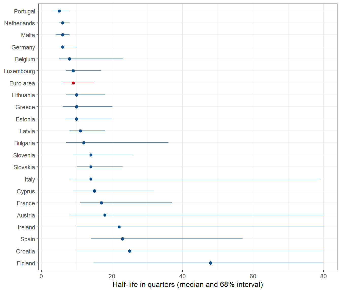
For the euro area, half of a gap is gone after 9 quarters. That is faster than the 14 to 15 quarters of the paper and the reproduction, and it is entirely due to the shorter sample: estimated on the data of the reproduction from 2001 instead of 1996, the euro area model also gives a half-life of 9 quarters. How fast a gap closes depends a good deal on the years from which the trend and the adjustment are estimated, which is worth keeping in mind for all numbers below. Across countries, half-lives range from Portugal (5), Germany (6) and Malta (6) quarters to Finland (48), Croatia (25) and Spain (23), with wide intervals for the slow ones.
Did the gaps close as the models expected?
All gaps hit their low point during the shock of 2021 to 2023. If the models are right, the gaps should since have closed by as much as the simulation implies for the number of quarters that have passed. The median path of each country gives the share of a gap that should be closed after a given number of quarters, which, applied to the gap at its low point, is the expected closure:
gap_summary <- gap_summary %>%
  mutate(expected_remaining = mapply(function(geo, h) {
           if (h == 0) 100 else median(remaining[[geo]][, h])
         }, geo, elapsed),
         expected_closed = -trough * (1 - expected_remaining / 100))
gap_summary %>%
ggplot(aes(x = expected_closed, y = closed)) +
geom_abline(intercept = 0, slope = 1, linetype = "dashed") +
geom_point(aes(colour = geo == "EA")) +
geom_text_repel(aes(label = geo), size = 3, seed = 1) +
scale_colour_manual(values = c("#0F4C81", "#C10016"), guide = "none") +
labs(x = "Expected closure of the gap since its low point, in pp",
y = "Actual closure, in pp") +
theme_bw()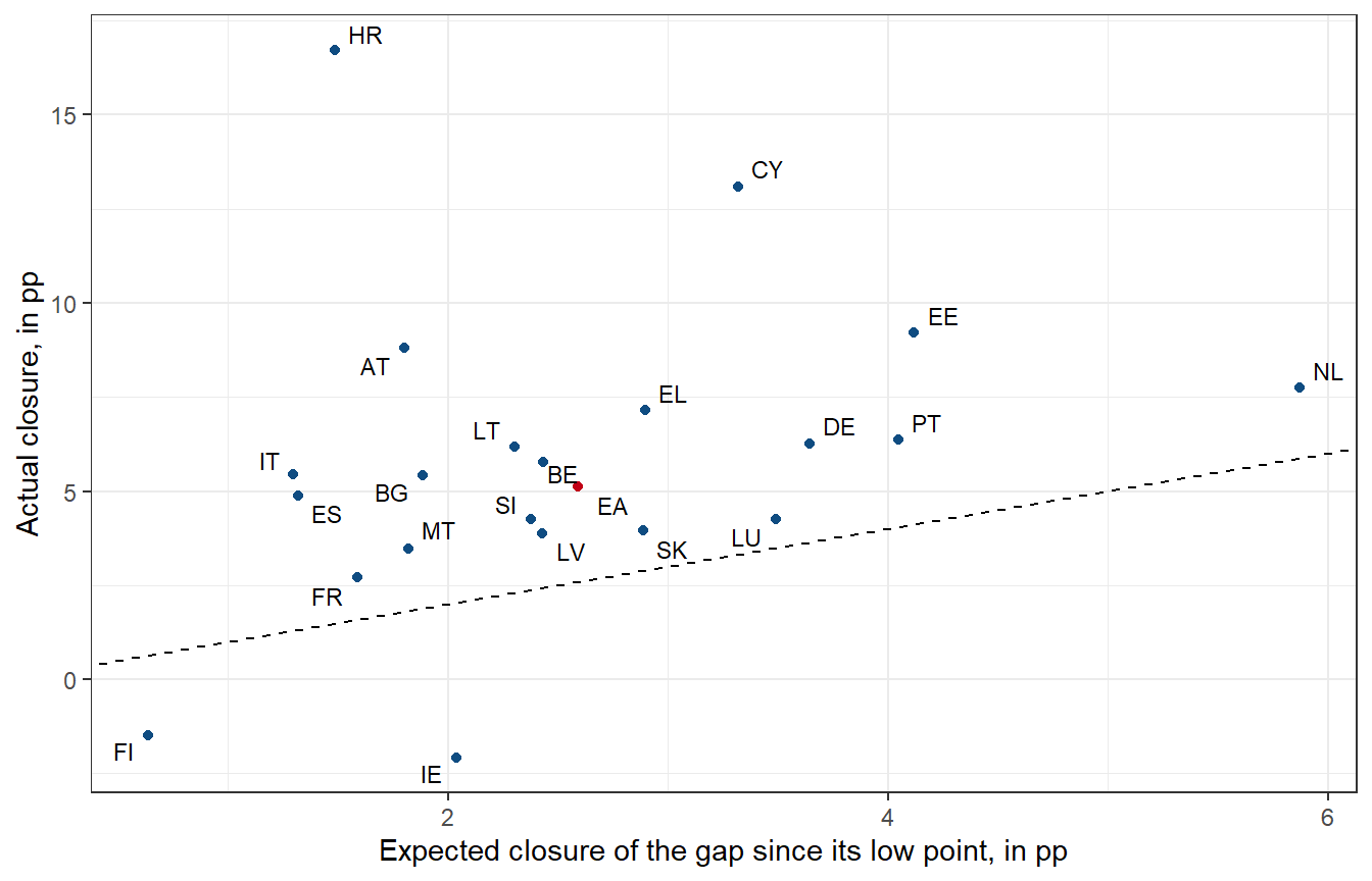
The dashed line marks closure exactly as expected. Of the 19 countries in which the gap has started to close, it has closed by more than the model expected in all of them, and in Croatia, Cyprus and Austria by far more: their gaps have turned into large positive ones, which the model, whose adjustment slows down as a gap shrinks, cannot produce. In Finland and Ireland, the gaps have widened further since 2023, although their models expected them to close.
A model that is estimated on the data it is checked against should do better than this. The pattern suggests that the speed of adjustment since 2023 has had more to do with country-specific forces than with the gap itself. A simple cross-country check points the same way. If the gap drove services inflation, countries with a deeper gap should have had more services inflation since, relative to their pre-pandemic average:
cross_section <- lm(excess_services ~ trough,
                    data = filter(gap_summary, geo != "EA"))

gap_summary %>%
  ggplot(aes(x = trough, y = excess_services)) +
  geom_smooth(data = filter(gap_summary, geo != "EA"),
              method = "lm", formula = y ~ x,
              colour = "#22282E", fill = "#DCE1E5", linewidth = 0.6) +
  geom_point(aes(colour = geo == "EA")) +
  geom_text_repel(aes(label = geo), size = 3, seed = 1) +
  scale_colour_manual(values = c("#0F4C81", "#C10016"), guide = "none") +
  labs(x = "Gap at its low point in 2021-2023, in %",
       y = "Services inflation since, minus 2001-2019 average, in pp") +
  theme_bw()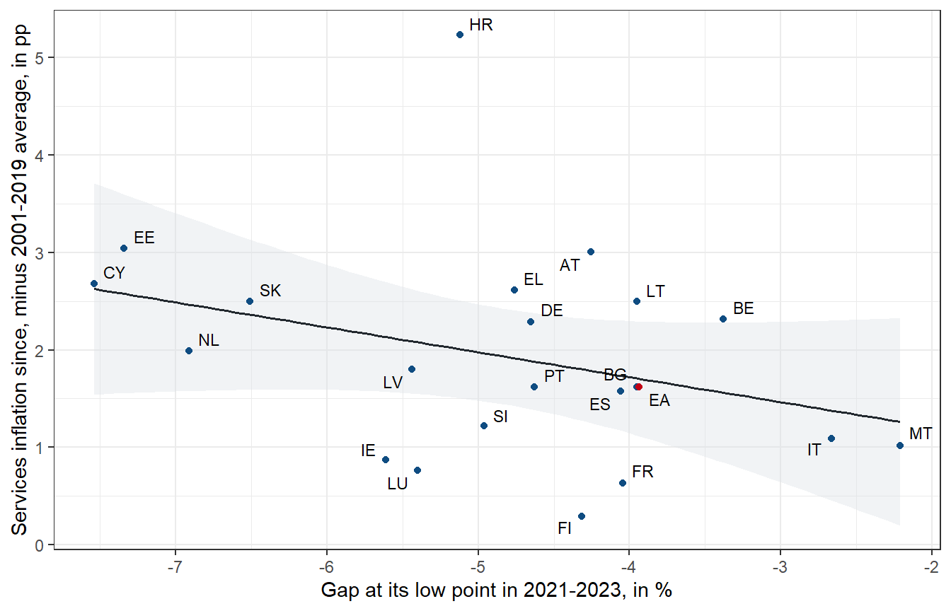
They did, but only weakly. The slope of the regression line across the 21 countries is -0.26 with a standard error of 0.17: a gap that was one percentage point deeper went along with services inflation that was 0.26 points higher per year, a relation that is not statistically reliable with 21 observations. Countries with similar gaps, such as Austria and France, have seen very different services inflation since.
The role of tourism
In the Austrian post, much of the overshoot of the relative price came from gastronomy, which weighs much more in the Austrian basket than in that of the euro area. Croatia and Cyprus, the two other countries with large positive gaps, are tourism countries as well. Is the size of gastronomy and accommodation in the basket what sets them apart?
gap_summary %>%
  left_join(weights, by = "geo") %>%
  mutate(tourism = 100 * (CP111 + CP112) / SERV) %>%
  ggplot(aes(x = tourism, y = latest)) +
  geom_hline(yintercept = 0) +
  geom_point(aes(colour = geo == "EA")) +
  geom_text_repel(aes(label = geo), size = 3, seed = 1) +
  scale_colour_manual(values = c("#0F4C81", "#C10016"), guide = "none") +
  labs(x = "Gastronomy and accommodation, % of services in 2026",
       y = "Relative-price gap in 2026 Q2, in %") +
  theme_bw()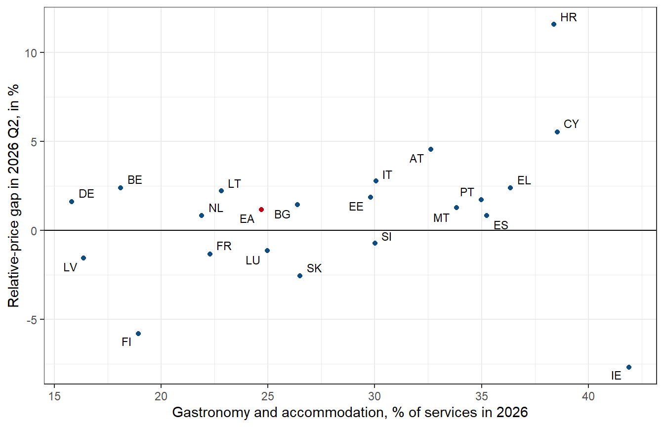
Not on its own. The correlation across countries is 0.26. Austria, Croatia and Cyprus have large shares and large gaps, but Spain, Portugal, Malta and Greece have shares as large and much smaller gaps, and Ireland, with the largest share of all, has the most negative gap. Without Ireland, the correlation rises to 0.58, so tourism-heavy baskets do tend to have larger gaps. Tourism may well have mattered, but a large share of gastronomy and accommodation in the basket is not enough on its own to push services above their trend.
What it means
- The mechanism is general. In most euro area countries, services inflation rises when services are cheap relative to their trend, and it is services prices, not goods prices, that close the gap. In this sense, the explanation of Hochmuth and Petz is not specific to the euro area aggregate.
- It explains little of what happened since 2023. In almost every country, the gap has closed faster than its own model expected, and in Croatia, Cyprus and Austria it has turned into a large positive gap. Across countries, a deeper gap in 2022 and 2023 went along with only slightly higher services inflation afterwards. Whatever drove the large differences in services inflation since then – wage setting, demand from tourists, administered prices – it was mostly not the relative-price gap.
- The answer depends on the trend. With a trend fitted from 2001, the euro area gap is 1.2% in the second quarter of 2026 and has closed. With the trend of the paper, fitted from 1996 to 2019 and extrapolated, services in the euro area are still several percent too cheap. The conclusion that a catch-up is still ahead rests on the assumption that the relative price will return to the steeper path of the years before the pandemic.
There are more reasons for caution. For the central and eastern European members, a linear trend over 25 years is a crude description of a relative price that rises with their income convergence and may flatten as convergence proceeds. The comparison of expected and actual closure is made with models estimated on the same data, which flatters the models, and still they fall short. And 21 countries are few observations for a cross-country regression.
References
Engle, R. F., & Granger, C. W. J. (1987). Co-integration and error correction: Representation, estimation, and testing. Econometrica, 55(2), 251–276. https://doi.org/10.2307/1913236
Hochmuth, P., & Petz, N. (2026). On the persistence of services inflation and the price of services relative to goods. OeNB Policy Brief 2026/11. Oesterreichische Nationalbank. https://www.oenb.at/en/daten-und-forschung/publikationen/publikationsreihen/policy-brief/2026/policy-brief-2026-11.html
Sax, C., & Eddelbuettel, D. (2018). Seasonal adjustment by X-13ARIMA-SEATS in R. Journal of Statistical Software, 87(11), 1–17. https://doi.org/10.18637/jss.v087.i11
